How to setup Recurring email reports in Google Analytics
How to setup Recurring email reports in Google Analytics:
If you have your website or other project has Google Analytics integrated, you can setup recurring email reports. This report will send an email at a specific interval of time to an email address that you have provided.
It is a good idea if you have multiple projects. You can setup a recurring email daily for all of your projects.
Google analytics data is important in many ways. You can compare the data with previous period to see how your business is performing. Based on the data, you can take decision.
For example, if you have a blog, you will get to know what are your top performing posts. You can write similar posts and link them from the top posts.
Another advantage of recurring email is that you can send the reports to multiple emails. If you are working as a team, you can set it to everyone’s email addresses.
It is pretty easy to setup a recurring email report from Google analytics. In this post, I will show you the steps required to do that.
Step 1: Go to Google analytics:
Open a web browser and go to Google Analytics home page. You need to login to the analytics site with your gmail account. If you are not logged in, login to your gmail account and use that to login to google analytics.
If you have multiple projects in Google analytics, you need to setup recurring email separately for each. Select the account from top left corner of the homepage, select the property and click on the view.
It will show you the home page of analytics.
Step 2: Select the data you want to share:
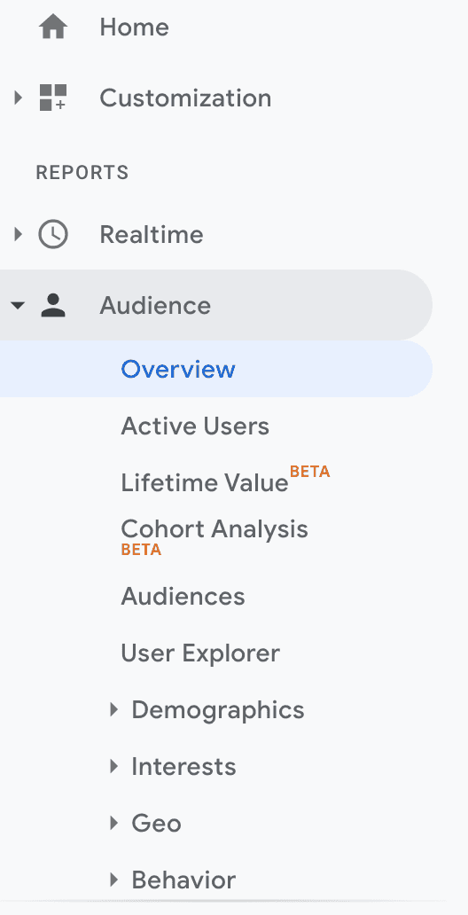
You need to select the data you want to share on mail. For example, if you want to get an overview of users for each week, select the Audience tab on left navigation drawer and click on the Overview tab.
It will show you the overview of the audience traffic your project is receiving. You can customize this screen to show different properties and also you can add comparison with previous period.
In this post, I will show you how to add a new segment and how to compare weekly data with previous week’s data. You can skip these parts if you already know how to do that.
If you check the top bar on this page, you will see that we can save, share or export the data of this screen.
Save will save the data inside your Google analytics account, export will allow you to export the data in PDF, Google Sheets, Excel or csv format and Share is to share the data with other emails.
Optional: Add a comparison:
You can add a comparison graph to this page. Comparison graph is useful to track how the website is performing. For example, we can compare today’s traffic with yesterday or this week’s traffic with last week.
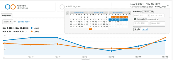
Click on the date range on top-right corner of the page and you can edit the comparison.
In the above image, I added a comparison of last week’s data with its previous week. You can click on the dropdown box to the right side of Date Range to edit the data.
It has the options to change to custom, today, yesterday, last week, last month, last 7 days, and last 30 days.
You need to click on the tick mark before compare to to enable the comparison. You can compare with a custom range, previous period or previous year data.
Once you are done with it, click on the Apply button to apply the comparison result. The page will refresh and it will reload the data with the new comparison you applied.
Optional: Add a new segment:
By using a segment, you can add more graphs to show with the current user graph. Click on the Add Segment button to add a new segment:
It will show you a list of different other properties that Google analytics is tracking. Most of these properties are tracked by Google Analytics automatically. For example, you can get information on organic traffic or mobile traffic or new users etc.
You can see that All users is already selected. This is because, audience overview adds All users segment by default.
You can select up to 4 segments. Click on the checkbox of the segments you want to add to the report. It will add one segment box to the right of All users box.
For each segment, it will automatically assign one new color. This helps to distinguish the graphs.
Once you are done with it, click on the Apply button at the bottom of this list to save the report.
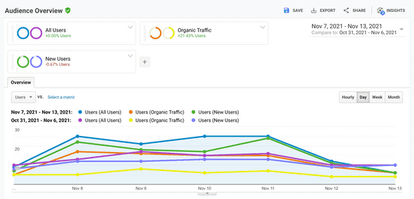
It will show the colors with the segments:
The first color is the color to represent the current traffic and the second color is the color to represent the previous traffic.
For example, in the above screen, blue represents all users for the current period and violet represents all users for the previous period.
Step 3: Add recurring email:
This is the final step. Click on the Share button on top-right corner of this page. It will open a popup as like below:
- From is the email from which this report will be sent. You can’t edit this email address and it is the gmail you used to login to Google analytics.
- In the To field, insert the email addresses you want to send the recurring mail. You can add single or multiple email addresses in this box. For multiple emails, you need to add them separated by a comma.
- Subject is the subject of the email that the recipients will get.
- Attachment is the report file type. It can be a PDF, Excel or CSV.
- Frequency can be once, weekly, daily, weekly, monthly or quarterly.
- Under the advanced option, you need to select the time period to keep the recurring email activated. Minimum value is 1 month and maximum is 12 months.
- You need to write something in the text field below the advanced option. This is the body of the email.
- Once you are done, click on the checkbox before I’m not a robot and click on Send. That’s all.


